Galaxy’s Visualization Framework
On this page
Galaxy Charts is Galaxy’s primary visualization framework for creating interactive, browser-based visualizations directly from Galaxy datasets. It supports seamless integration of third-party visualization plugins and includes a broad set of JavaScript-based visualizations, from standard charts such as bar, line, scatter, and pie to advanced viewers for molecules, proteins, networks, and phylogenetic trees.
Learn more at https://charts.galaxyproject.org/.
Key Points
- Fast, interactive visualizations in the browser
- Wide range of chart types and specialized viewers
- No external servers or downloads required
- Support for third-party visualizations and custom plugin development
Example
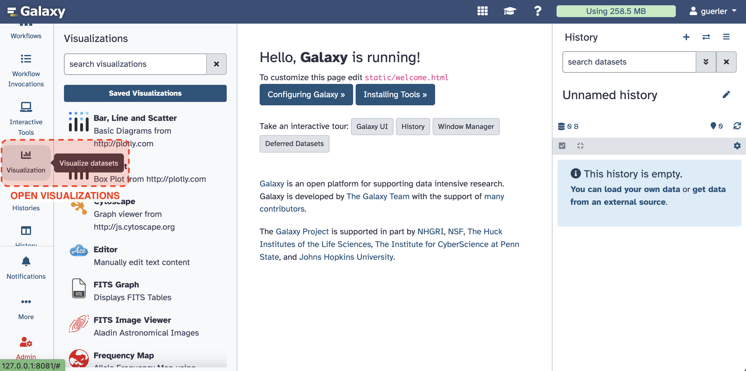
1. Click on Visualization from Activity Bar

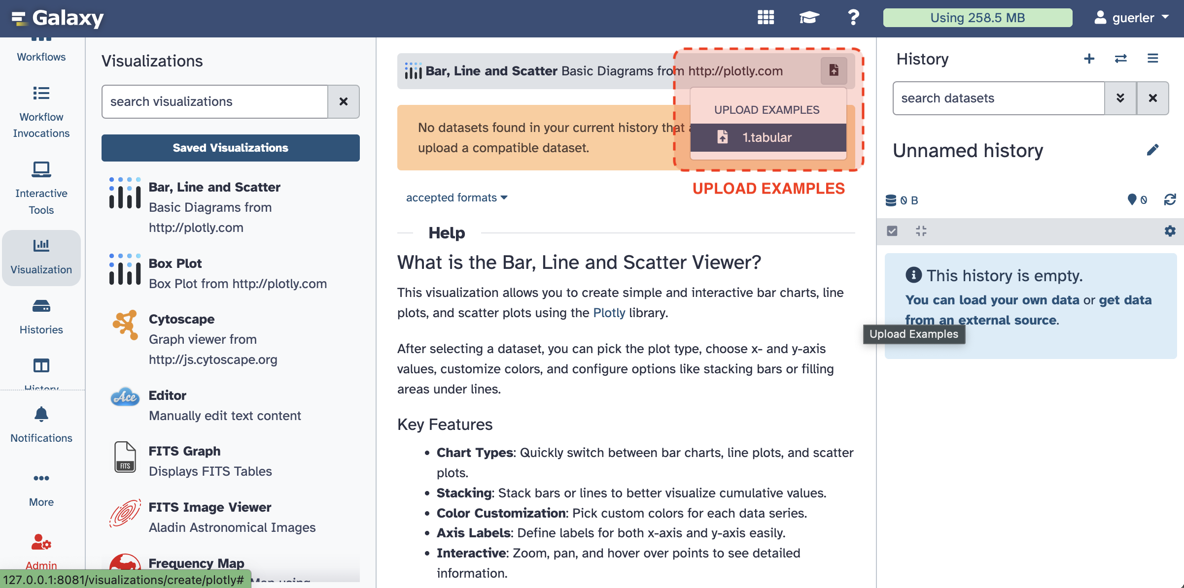
2. Select Bar, Line, and Scatter and Upload Example.

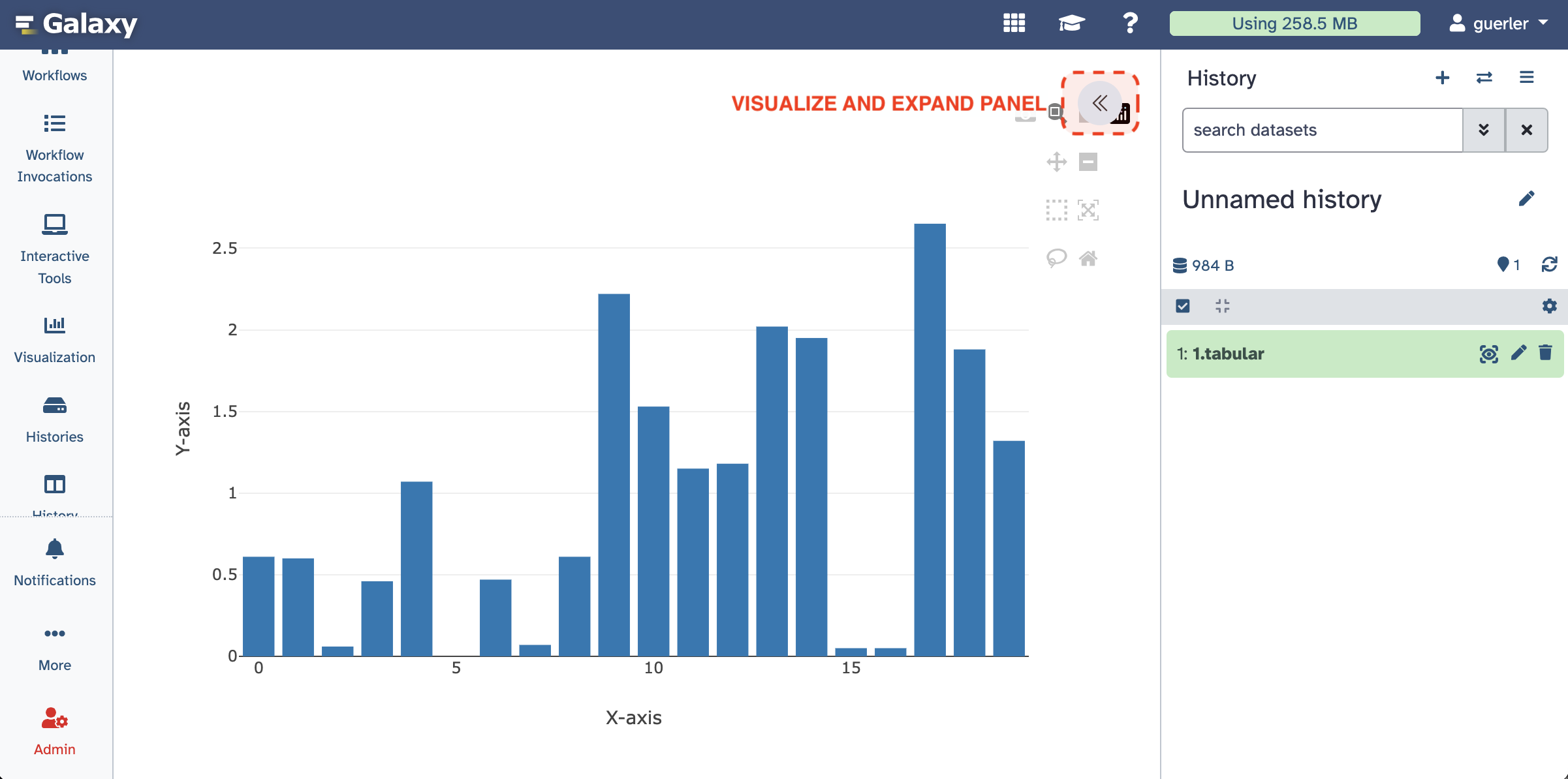
3. Visualize and Expand Side Panel

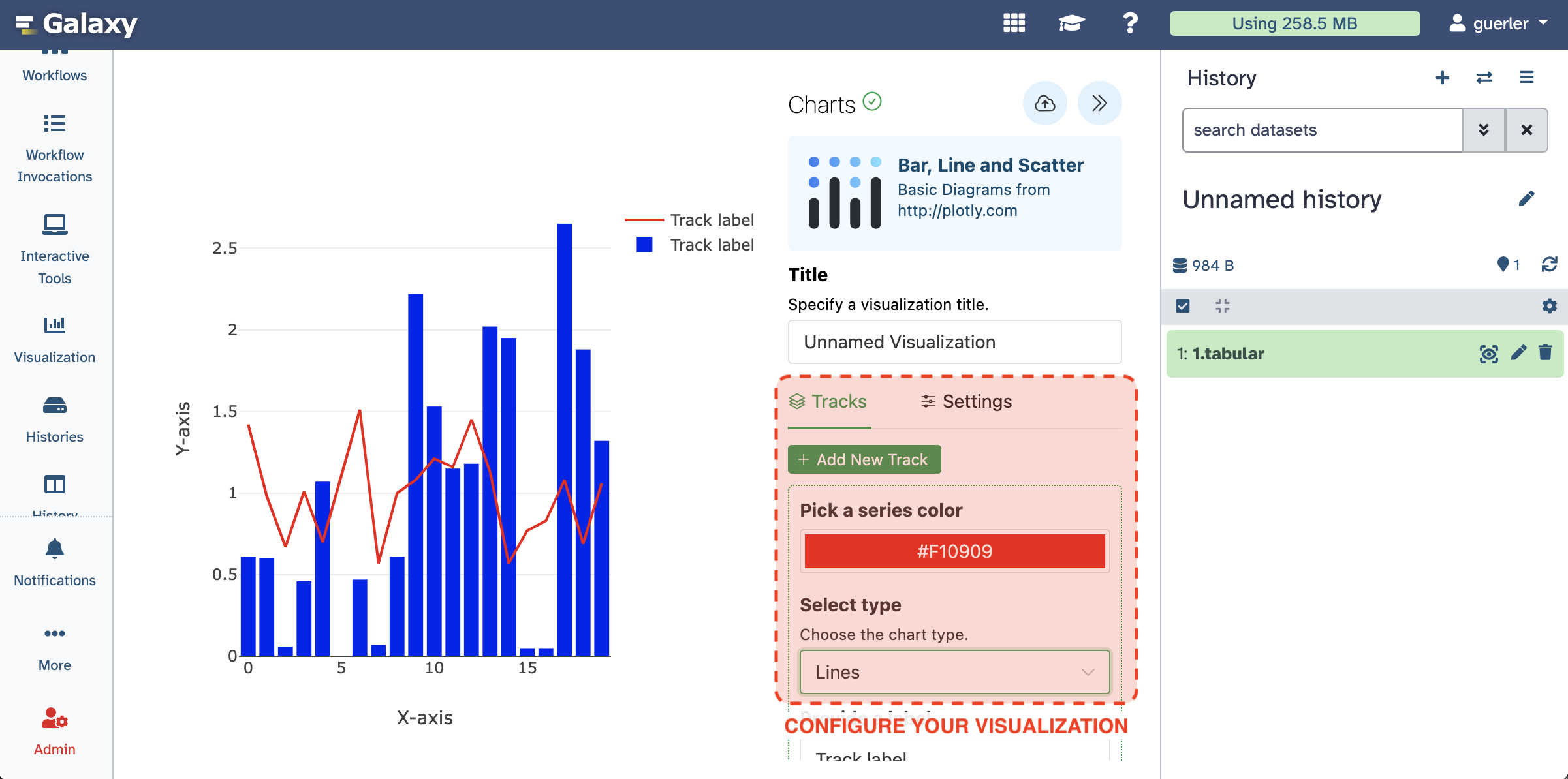
4. Add Tracks and Settings

You can now save and share your visualization with others.
Visualization Types in Galaxy
Galaxy provides three major visualization categories, each serving different analysis needs:
1. Galaxy Charts Visualizations
These are rendered directly in the browser using JavaScript frameworks. They are lightweight, reactive, and tightly integrated with the Galaxy dataset system. Typical examples include:
- Statistical charts (bar, scatter, line, pie)
- Genomic tracks and feature maps
- Network and molecular viewers
- Custom plugins built with JavaScript or Vega-Lite
Use case: Interactive inspection and sharing of datasets directly inside Galaxy.
2. Tool generated Visualizations
These are static or semi-interactive graphics produced by Galaxy tools during execution. They rely on libraries such as matplotlib, R’s ggplot2, or Plotly, and are rendered as images or HTML outputs attached to history datasets. Typical examples include:
- Quality control plots (FastQC, MultiQC)
- Volcano and MA plots from differential expression tools
- Heatmaps and PCA plots generated by analysis tools
Use case: Automatically generated visual summaries as part of analytical workflows.
3. Interactive Environment Visualizations
These visualizations are created dynamically within Galaxy’s interactive environments such as JupyterLab and RStudio. They allow full code-driven visualization and exploration using Python, R, or JavaScript libraries. Typical examples include:
- Custom matplotlib, seaborn, or Plotly figures in JupyterLab
- R-based statistical visualizations in RStudio
- Data exploration dashboards built interactively
Use case: Flexible, programmable visual exploration within a reproducible Galaxy context.
